Today we’re looking at landing pages and how to create high converting landing pages, whilst still coming across as a decent, law abiding human being! Read: nothing weird, wacky and creepy. The following is a post from Reddit user Tobias Pettigrew that I include here. His work:
Click.
Uhh…no, I don’t want to get super free awesome hourly advice from your mailing list.
GO AWAY, POPUP!
Wait, what is this website even selling? And who is that smug, synergistic, suit-donning idiot in the stock image?
There’s a 6-section form…that wants my…address…phone number…and my deepest…darkest…secrets?
Which of the 4 buttons do I click? NOT ANOTHER POPUP! exits website.
The above might sound familiar. Like mad scientists, online marketers have been getting carried away when it comes to increasing their sites’ conversion rates. But instead of a conversion-bumping love potion, many sites offer visitors a splutter-inducing concoction that repels potential customers.
When you look at marketing from a cold, strategic perspective, it’s easy to lose touch. Each decision becomes more about numbers, and less about the real people browsing your website.
As a freelance copywriter, I believe in a human-centred approach to marketing. Because irritating people into buying what you’re selling is not only devious, it’s also ineffective. Cut the crap, connect with visitors, and solve their problems? Now there’s a winning solution.
Write Like a Human
Write simply. Write truly. Write in their language. Vary your sentences. You are not a robot. The content is, by far, the most important element of your landing pages. A pretty page won’t sell your product or service. Well-written copy will. Here are some tips to get there:
- Cut the crap – Superlatives, industry jargon, and empty phrases have no place in your landing pages. Use Unbounce’s Dejargonator extension to execute the offenders immediately.
- Create a conversation – Instead, create a conversation with your readers. Talk in their language. Depending on your audience, this will vary. But always try to get your message across in a simple, human way. Be humorous if you think it’s suitable. Just…don’t try too hard.
- Be accurate – Nothing like an eror (!) or awkwardly, placed, punctuation- to undermine your hard-earned trust. Double, triple and quadruple-check your content. Better yet, hire a professional.
Prove Yourself!
Save the empty promises for your estranged childhood friend or that nagging mother-in-law. Every time you make a hyperbolic statement without supporting it with evidence, you alienate your readers.
Facts
Instead of…
“Revolutionise your invoicing system and make massive savings!”
Try…
“Save $1,500 with free, all-in-one invoicing”
If you don’t have evidence that your product or service works, that should be one of the first things you work on. Proving this to your prospects is both a massively important trust factor and selling point. Can’t prove it through facts? Use images or video to show it working. Get creative.
Testimonials
One of the most vital aspects of your landing pages are testimonials. Showing that you’ve solved the problems of people similar to the reader is a highly-effective strategy of winning them over. But people are suspicious. With the amount of dodgy product reviews or shady video testimonials used in bogus marketing schemes, wouldn’t you be?
Use…
- Headshots
- Specific statistics or details
- Full names and contact/website info
- High-profile companies/individuals
Less is More
Many landing pages cognitively overload their visitors. That is, they force so much in their faces that the visitor feels overwhelmed, and is likely to flee to the safety of some other page. Not only that, some of these methods can undermine any trust you could’ve built. Here are some common mistakes of over-eager marketers:
- Pop-up boxes – Could they potentially increase your conversions? Yes. But…most pop-up boxes, simply, irritate the hell out of visitors. If you’re set on using them, try time-delay pop-ups or display the pop-up at the end of the page.
- Too many CTAs – Subscribe, purchase, download AND attend your webinar? You’re having a laugh. Choose one, important CTA for your landing pages, and stick with it. More here.
- Your USP isn’t clear – If your reader is asking themselves “what are they selling?” after 5 seconds, your landing pages are failing. Make the ‘what’ and ‘why’ as clear as possible – what you’re selling and why it’s beneficial to your readers. Selling too hard – Is your visitor ready to commit to buying your product after 10 seconds on your page? Probably not. Leave the hard selling to further down the sales funnel. Instead, offer more information or, even better, something for free.
- Cluttered design – The design of your landing pages has a huge impact on its effectiveness. Keep design elements, content, and your call-to-action as minimal as possible. Here are some minimal designs to inspire you.
Close the Deal
There’s nothing unethical about selling – as long as it’s done in a clear, transparent manner. Here are some tips to closing in an effective ye t direct way:
- Handle objections – Are your visitors worried about committing to your service? Perhaps they doubt the quality? Handling and resolving their objections requires an intimate understanding of your target audience. The easiest way to find out their objections would be to ask them!
- Value proposition – A great way to hook your prospect is by the principle of reciprocity. Give them something valuable for free, and they’re far more likely to feel like helping you out, too. Ideas include: an eBook, a free month, a podcast, cheat sheet, or more. Here are some examples.
- Clear CTA – Direct your readers to desirable call-to-actions – whether that’s a contact, a subscribe, a purchase, or simply to learn more. Ideally, try to use only one CTA per landing page.
37 Landing Pages Analyzed – Learn From Their Mistakes
I’ve recently been critiquing landing pages for any Tom, Dick and Larry who wanted one. It’s a huge time investment, but people get in-depth, actionable feedback, I get to flex my critical analysis skills AND connect with potential leads. Not too shabby.
I wanted to use this opportunity to explore these patterns and help you avoid the most common mistakes that keep your landing pages from being the kickass high-conversion machines you deserve.
Disclaimer: I use curse words and strange British slang sometimes. I’m Scottish. That pretty much explains it all.
Website Loading…
Does your site take 4 seconds to load? You’ve lost 25% of your visitors. 10 Seconds? Say goodbye to another 35%. Online browsers are impatient. In fact, 47% of consumers expect a web page to load in 2 seconds or less. Brutal, right? If you’re scrambling in panic, relax.
Test your landing page speed here.
Fix
There are numerous ways to improve your site’s speed. I’m no techie, so I’m going to refer you to the more knowledgeable Kissmetrics. But this is one of the easiest way to lose prospects. Naturally, I have to include it as the first on this list
Bad Headlines
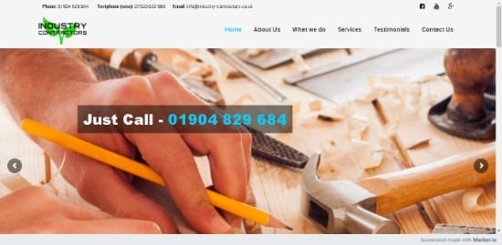
Just call…really?
You provide outstanding services and you’re passionate about your work? That’s just great, buddy. You do ‘marketing made simple’ or ‘revolutionise how companies do X’? Sure you do.
Look, writing headlines is difficult. But it’s damn important. You’ve probably heard the 80/20 rule by now. 80% of your visitors will read your headline, but only 20% will read further. When you’re against these odds, you better make your headline count!
Fix
AVOID being…
- Vague – If I don’t know what you do OR what you can offer me after reading your headline, I probably won’t read further.
- Descriptive – What’s in it for me? Simple facts aren’t enough. Put yourself in your customers’ shoes. How are you improving their lives?
- Cliched – You’re innovative? Think differently? Save it, please. Your customers are rolling their eyes. PROVE IT!
TRY to use…
- Benefits – How will your product/service make your reader a better version of themselves? Time and money are two universal factors in peoples’ lives.
- Numbers, Facts and Stats – Use these to build authority and believability. Just don’t go overboard!
- Specificity – How, specifically, will you improve their lives? Get into the nitty-gritty.
- Curiosity – Unusual or dramatic word choice (kill, death, destroy) and provocative questions are a great way to keep your readers reading. CrazyEgg’s guide to writing headlines has some good examples. Ghost-written by yours truly, by the way. Shh…
- Brevity – Don’t make your headline a paragraph. Keep it under 10 words. Your readers are an impatient bunch.
Ugly As Sin
Ouch, toooo much text!
Okay, okay, I’m a copywriter. And my own website is far from a work of art. But…according to the powers that be (Google), users form design opinions in 50 milliseconds. And 75% of people judge a business’s credibility based on design.
So many websites think ‘more is more’. They fill their landing pages with information, images, and options. But all they’re doing is destroying their credibility and leaving users feeling overwhelmed and put off.
Is your website badly-designed? Cluttered? It could be killing your conversions.
Fix
Get a designer. A good one. If you’re cheap, here are some tips:
- Contrast – A bland, monotone site isn’t just unattractive. It fails to draw attention to key elements – namely, headers and desirable call-to-actions.
- Minimal – Don’t overwhelm your users. Use white space and concise, spaced-out content to make the site readable and easy on the yes.
- Hierarchy – Content should have a visual order, as visitors read in a very specific order. Contrast, balance, alignment…they all have an important part to play. Read all about it here.
- Readability – Fonts, images and elements should all work harmoniously. Avoid unpleasant contrasts or hard-to-read text.
Badly-Chosen Images
Shiny happy…stock image people!
Images communicate far more quickly and effectively than words. Ah crap…I chose the wrong career. Anyway, the thing is that images are processed in milliseconds – and using them in the right way can communicate some powerful things for your landing pages.
Fix
Avoid…
- Stock images – Business people having a great old time, laughing, doing BUSINESS! What could go wrong? Everything, according to Intechnic. These are the worst kinds of images you could use.
- Low-quality – Crappy quality images are just…ugly. Invest a little more time and use high-quality, high-res images for your landing pages.
Use images of…
- Products – Whether you offer services or products, you can use high-quality images of these to develop trust and quickly explain what you offer.
- People – Images of people – especially people similar to your reader – create trust. Direct eye contact with the reader will increase engagement. Images of people using your products – that’s even better.
- Directional cues – Showing people where to look or click through shapes, arrows, or eye gaze direction is a powerful way to influence how your audience behaves.
Going For The Kiss Too Early
BUY NOW!! WE HAVE THE BEST DEALS!
You barely met her, and you’re already babbling about future dates, family meetings…children! You’re just too keen. She was interested, but you’re starting to scare her. You have that mad, needy look in your eye. She backs away, slowly…and leaves your page, never to be seen again.
This is a common mistake – in romance and marketing. Asking for their money before they even know who you are is an easy way to lose a customer.
Fix
- Prove yourself first – How, specifically, will their lives be better with you in it? How can they trust you? Empathise with their problems, prove that you can help, and show how you’ve helped other people like them (testimonials, case studies).
- Provide options – Yes, this might go against the grain. But offering two call-to-action options is a good way to keep everyone happy. Typical options might include a hard CTA and soft CTA (e.g. ‘start free trial’ and ‘learn more’.
- Emails – Many visitors won’t be ready to convert. That’s why capturing their email is super effective. A well-written emailing sequence can turn a doubtful visitor into a customer.
‘Me, Myself & I’
You’re talking about your services, so your company must be the most important thing here, right? Wrong! It’s all about the customer. And talking about how your company is a special little snowflake is a sure-fire way to send your prospects running away from your landing pages.
Fix
- Change the language – Stop with the ‘we’ and ‘our’, and start with the ‘you’ and ‘your’. Talk directly to your readers and create a conversation. This isn’t your CV, after all.
- Put yourself in their shoes – Yes, you might have experience, you might be ‘innovative’, you might do x, y, and z. But why does all of this matter to your reader? Translate your ‘features / descriptions’ into tangible benefits that’ll improve their lives.
- Transform features to benefits – You do X and Y, but what’s the end result of X and Y for your reader? For example, ‘digital marketing made simple’ might turn into ‘Increase your online conversions by up to 217%’.
No Real Incentives
Read more? zZZ….
Why should I ‘subscribe’ or send you a message? What’s the direct benefit to me – and why is it important I do so right now? Many landing pages fail to create effective call-to-actions. In fact, some don’t have a call-to-action at all!
Fix
- Freebie – Offer something free. Kissmetrics and CrazyEgg – brainchildren of Neil Patel – both do this fantastically. Give them something, and they’ll be more likely to reciprocate in return.
- Create urgency – Creating a sense of urgency can seriously drive your conversions higher. This could be by a lack of supply (limited places available) or a lack of time (offer expires x date).
- Visibility – Your call-to-action can’t be desirable if no one notices it! Use contrasting colours and a larger font size to make yours stand out.
High Converting Landing Pages
That’s it. Critiquing these websites is a lot of work, but I’ve learned from it.
Have anything to add? Feel free to comment below with any thoughts or suggestions!
Need help writing landing pages…or copy in general? I’m a freelance landing page copywriter with a focus on writing creative, high-conversion copy for SMEs, agencies and startups.
I’m offering a free landing page evaluation. If you’d like to learn more visit my website to sign up.
Matt Crawford
Related posts
2 Comments
Leave a Reply Cancel reply
This site uses Akismet to reduce spam. Learn how your comment data is processed.





Thanks for your words and kind help in helping me set up a funnel.
Absolutely, Alejandro!