
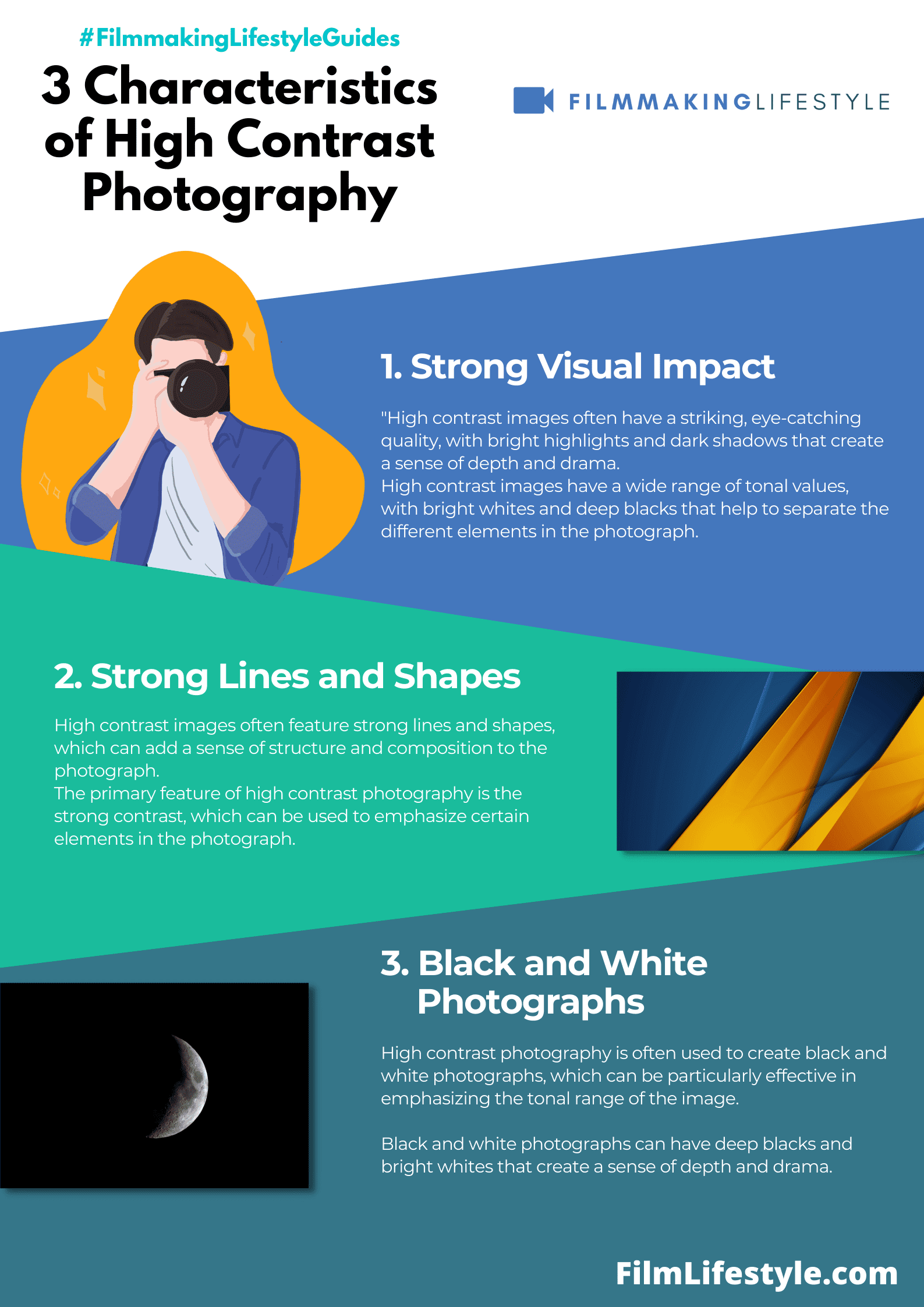
High contrast photography is an effect that creates a very specific mood and feeling in an image.
The shadows become darker, the highlights become brighter, and the entire image becomes more dramatic.
In this guide, I’ll break down what high contrast photography is and how you can use it to make your images stand out.
Let’s start by breaking down what high contrast photography really means and how it differs from other types of photography.
high contrast photography
What Is high contrast photography?
If you’re new to photography, you might be looking for a definition of high contrast photography.
To start exploring the high contrast photography world, it’s best if you understand what contrast is and why contrast is important.
Without enough contrast, your image will look flat and uninteresting. With too much contrast, your image will look over-processed and unnatural.
Images with high contrasts tend to be more dramatic looking than images with low contrasts.
That’s why most people prefer high-contrast photos to low-contrast ones: they’re more interesting to look at.
High contrast photography is an artistic tool that turns ordinary scenes into dramatic statements.
It’s about capturing the dance between light and shadow to create striking visuals that grab attention.
In this article, we’ll explore the ins and outs of high contrast photography, from its powerful impact on composition to tips for mastering this bold style.
Get ready to transform your photos from flat to fascinating with our deep jump into high contrast imagery.

What Is High Contrast Photography
High contrast photography is the art of using stark differences in light to shape the narrative of an image.
Here at Filmmaking Lifestyle, we’ve embraced this style to enhance the visual drama and convey emotion in a way that gentle gradients often cannot.
Through this technique, photographers and cinematographers alike can guide their audience’s focus and accentuate the form, texture, and edges within a frame.
At its core, high contrast photography commands our attention by painting with shadows and light.
In technical terms, it’s about capturing a wide range of tones from the darkest blacks to the brightest whites with minimal mid-tones.
This results in powerful imagery reminiscent of classic noir films where mood and atmosphere are central.
Achieving high contrast in your photos isn’t just about the subjects you choose but also the conditions under which you capture them.
Consider the following factors:
- The time of day – early morning or late afternoon can offer the most striking contrasts,
- Weather conditions – a sunny day provides sharper contrasts than an overcast one,
- The environment – urban settings with their hard lines and textures can be ideal.
Artists such as Ansel Adams and contemporary filmmakers like Robert Rodriguez have skillfully harnessed high contrast to create their signature styles.
In Schindler’s List, Steven Spielberg utilized high contrast to imbue his frames with emotional depth, and enhance the impact of the narrative without uttering a single word.
Whether through photography or cinema, high contrast is a powerful tool in the storyteller’s arsenal, one that we at Filmmaking Lifestyle encourage our readers to explore and master.
The Power Of Light And Shadow
Photography is often described as painting with light, and nowhere is this more evident than in high contrast scenarios.
It’s here that light and shadow play a pivotal role, characterizing the mood and texture of an image.
In high contrast photography, light becomes our paintbrush, and shadows are the canvas on which we etch our visual stories.
Our mastery over this stark, visual dialect hinges on understanding how shadows and highlights can interact:
- Shadows can define the edges of a subject or scene,
- Highlights can direct the viewer’s focus to specific areas,
- The interplay between light and dark areas can form intriguing patterns or lead the eye through a composition.
Artists like Ansel Adams were adept at utilizing the power of light and dark to create landscape photographs with a dramatic sense of depth and grandeur.
The high peaks and deep valleys of his photographs are not just physical locations but also a dance of luminosity and darkness.
Similarly, the unique storytelling in Steven Spielberg’s films often leverages the stark contrast between brightness and shadows to heighten emotion and tension.
We understand that manipulating the extremes of contrast is not solely about aesthetics; it’s a nuanced language used to convey feeling and narrative.
Light can represent hope or discovery, while shadows might suggest mystery or fear.
This tonal vocabulary is key in crafting images with palpable atmospheres, whether in still photography or motion pictures.
Learning the subtleties of high contrast photography isn’t just about technical proficiency—it’s about expanding our visual literacy.
We’re not just taking pictures; we’re creating moments that can encapsulate a spectrum of human experiences through the simplest of elements—light and dark.

Tips For Mastering High Contrast Photography
When diving into the world of high contrast photography, understanding the interplay between light and shadow is essential.
To create striking images, we consider not just the quality of light but also how it interacts with our subject.
Our aim is to harness the drama and emotion that come with stark lighting differences.
Here are a few tips that can help us master this technique:
- Shoot During the Golden Hour – This is the period shortly after sunrise or before sunset when the light is softer and the shadows it casts are longer and more defined. It’s an ideal time to capture high contrast images with a warm glow.
- Use Hard Light Intentionally – Bright, midday sun provides a type of hard light that is perfect for high contrast photography. We position our subject to maximize the impact of the shadows and highlights.
The choice of background can greatly influence the perception of contrast in our images.
A dark background can make a lightly lit subject pop, while a bright background with a darker subject draws in the eye differently.
We look for backgrounds that will complement our subject’s lighting to accentuate the high contrast effect.
Another approach we take is to Manipulate Shadows to shape our photos.
Manipulating shadows involves arranging objects, subjects, or ourselves to cast intriguing shadows that become part of the composition.
By doing so, we add layers and a sense of depth to our imagery.
finally, it’s critical to get familiar with post-processing techniques.
Tools like
We adjust levels, curves, and sharpness to transform a good photo into a great one:
- Increase clarity to make the details stand out,
- Adjust the contrast slider to deepen the difference between light and dark areas,
- Play with the highlights and shadows to find the perfect balance.
Through patient practice and a keen eye, we’ll find ourselves developing a stronger sense of how high contrast can tell a compelling story through our images, much like Ansel Adams or Steven Spielberg have done in their art forms.
Whether we’re out in nature capturing the rugged beauty of the landscape or setting up a dramatic studio shoot, high contrast photography offers endless opportunities to express our creative vision.
Using Contrast To Create Dramatic Composition
High contrast photography isn’t just about capturing light and dark elements; it’s about leveraging these extremes to forge dramatic compositions that resonate with viewers.
Mastering this technique can transform a mundane scene into a profound visual narrative.
The stark difference in tones emphasizes the main subjects, guiding viewers’ eyes precisely where we want them to land.
When composing a high contrast photograph, consider the following elements to dial up the drama:
- The arrangement of light and shadow,
- The balance between the highlight and shadow areas,
- The textures that are revealed in heightened contrast environments.
Timing is also crucial when trying to capture the perfect contrast.
Golden hour affords soft, directional light that helps in creating images with a natural contrast that isn’t too harsh.
On the other side of the spectrum, midday sun can produce strong, vivid contrasts that may be ideal for certain subjects.
Artfully managing contrast in photography is akin to a painter choosing the right palette for a masterpiece.
Take Ansel Adams’ iconic black-and-white landscapes, which are studies in the power of contrast.
Similarly, contemporary films employ high contrast visuals to evoke a particular mood or period.
Think of the rich shadows and striking highlights that are hallmarks of film noir.
Cinematographers manipulate contrast to add depth and emotion, crafting scenes that linger in the memory long after the credits roll.
Working with contrast requires a keen eye for the interplay of light across various surfaces.
Textures, from rough brick walls to smooth glass, become pivotal characters in our images.
They provide a canvas on which light and shadow play out their eternal dance, and it’s our privilege to capture that dance with every click of the shutter.
By honing this skill, we enrich our visual storytelling arsenal, offering our audience a richer, more evocative experience.
Post-processing Techniques For Enhancing Contrast
After capturing your high contrast images, the magic continues in the digital darkroom.
Post-processing is a powerful tool for photographers seeking to push the boundaries of contrast in their work.
Our journey doesn’t end at the click of the shutter; it’s just beginning.
Editing software like Adobe Lightroom and
We adjust the blacks and whites to deepen shadows and brighten highlights, creating a punchier image.
Consider these adjustments – – Exposure – Fine-tune overall image brightness without affecting contrast.
- Contrast Slider – Directly increase or decrease the contrast of the entire image.
- Highlights/Shadows – Adjust the bright and dark areas separately for a more controlled approach.
Selective contrast adjustments can be even more impactful.
We use tools such as the Adjustment Brush, Graduated Filters, and Radial Filters to apply contrast to specific areas of an image.
This highlights the subject or certain elements that we want to stand out.
With photography akin to painting, think of Dodging and Burning as your brushwork.
These techniques allow us to lighten (dodge) or darken (burn) areas of the image to guide the viewer’s eye.
It’s an age-old darkroom technique that’s still equally relevant in the digital era.
Utilizing the Tone Curve presents another layer of contrast control.
The curve lets us adjust the contrast by creating an ‘S’ shape – this adds depth to the shadows and brightness to the highlights in a more subtle way than the basic contrast tools.
Integrating colors in our contrast work can lead to stunning visual results.
We adjust saturation and vibrance for colors to pop against each other, further enhancing contrast.
The result is often a more dynamic and visually compelling image.
In the realm of high contrast photography, every choice we make in post-processing should serve the story we’re trying to tell.
From subtle shadows to stark highlights, the balance of elements we manipulate during editing can transform the narrative power of our images.
What Is High Contrast Photography – Wrap Up
We’ve journeyed through the dynamic world of high contrast photography and discovered how the dance of light and shadow can create compelling images that tell a story.
We’ve learned that the right timing can enhance natural contrast and that post-processing is an art form in itself.
By mastering the tools and techniques available in editing software, we can elevate our photographs from good to truly stunning.
Remember, it’s not just what we capture, but how we choose to present it that defines the impact of our work.
Let’s continue to use contrast to shape the narratives within our images and share our unique vision with the world.
Frequently Asked Questions
What Is High Contrast Photography?
High contrast photography involves capturing images with a stark difference between the lightest and darkest areas, accentuating the interplay between light and shadow.
What Are The Key Elements To Consider In High Contrast Photography?
When composing a high contrast photograph, consider the arrangement of light and shadow, the balance between highlights and shadows, and how the textures appear under heightened contrast.
Why Is Timing Important In High Contrast Photography?
Timing is critical in high contrast photography as certain times of day, like the golden hour, provide soft, directional light that naturally enhances contrast in images.
How Is Working With Contrast In Photography Similar To Painting?
Just as a painter selects the right palette for a piece, photographers use light and shadow to create visual contrast, essentially “painting” with light to shape the narrative in their images.
Can Contrast Be Adjusted During Post-processing?
Yes, contrast can be adjusted in post-processing using editing software like Adobe Lightroom and
What Is The Role Of Dodging And Burning In High Contrast Photography?
Dodging and burning are post-processing techniques used to selectively lighten (dodge) or darken (burn) specific areas of an image, further enhancing the contrast and focal points.
How Does The Tone Curve Function Affect An Image’s Contrast?
The Tone Curve in editing software provides control over an image’s luminance, allowing photographers to fine-tune contrast at various tonal ranges for a more nuanced composition.
Why Is The Balance Of Elements Important In Post-processing?
In post-processing, the balance of elements like exposure, highlights, and shadows is crucial as it can alter the narrative power of the image, making the visual story more compelling and impactful.