
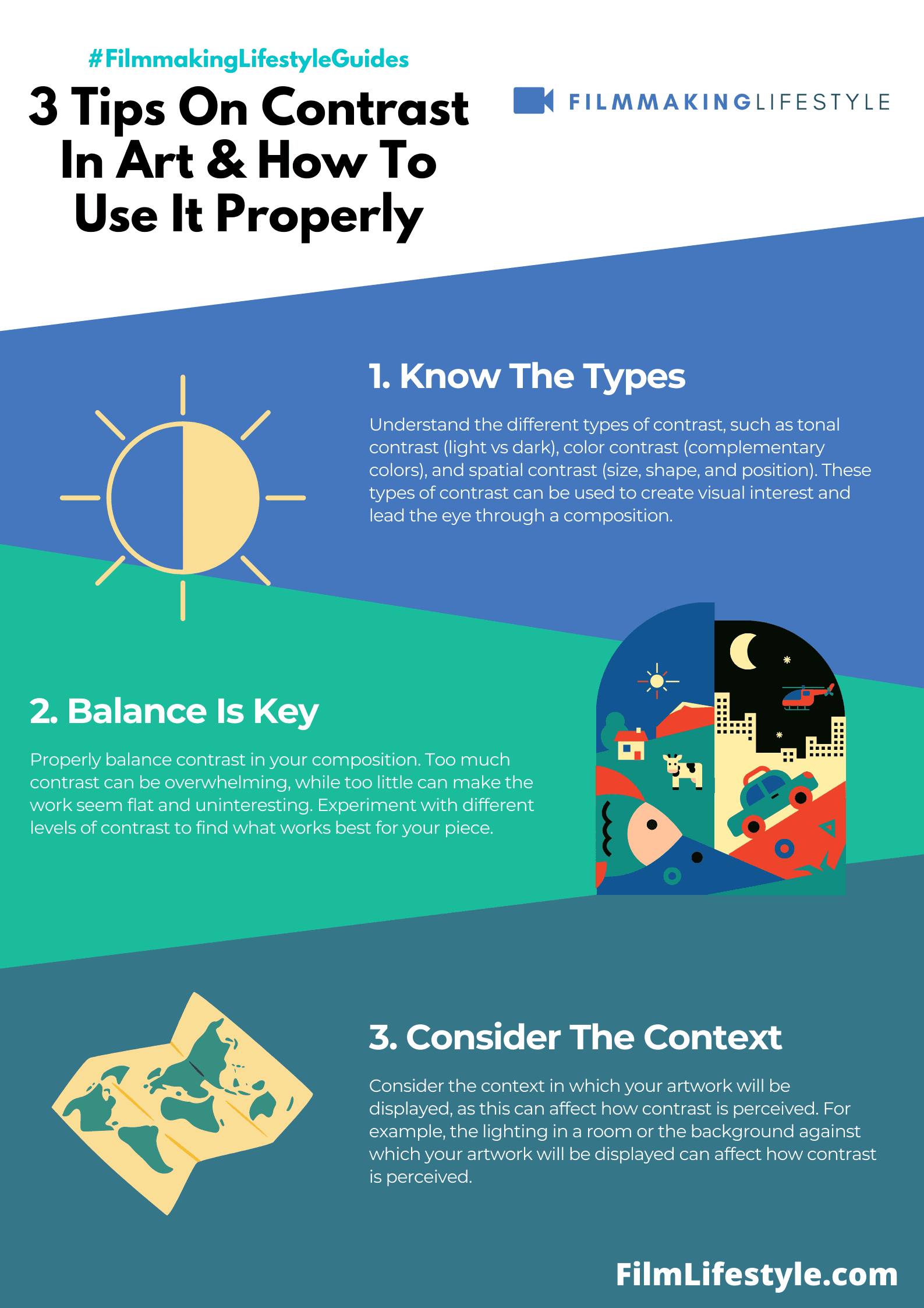
A contrast in art and composition is any difference between the parts of a composition, such as light and dark, warm and cool, or soft and hard. It can be achieved by using different textures, tones, or shapes.
What Is Contrast In Art
What Is Contrast In Art?
Contrast is a key element of any artwork. It can be used to create interest, add depth, and highlight certain elements of the image.
Contrast in art means the difference between light and dark, or color and black. This can be achieved by using different colors or tones of one color, as well as varying shades of one color. This helps form an image with more visual impact than just using one tone would do.
For example, if you have a painting that has a blue sky and a green grass field in it, but there are also yellow flowers in the field, then the contrast created between these two elements will help make the painting more interesting.
In the world of art, contrast is the secret spice that turns a good piece into a masterpiece.
It’s that dramatic clash between elements that captivates our eyes and stirs our emotions.
We’ll explore how contrast shapes our perception and why it’s a crucial tool for artists.
From light and dark to color and texture, understanding contrast is key to appreciating and creating art that resonates.
What Is Contrast In Art
Contrast in art is the deliberate use of opposing elements to create visual interest or draw attention to a focal point.
Through contrast, artists can convey narratives, evoke emotions, and construct a more engaging viewer experience.
It’s an essential tool in our toolkit, allowing us to create depth and dimension within a scene.
In the realm of filmmaking, contrast plays a crucial role in storytelling.
Visual contrast in films can be achieved through various techniques such as:
- Color grading – using opposing colors on the color wheel to create visual tension or harmony.
- Lighting contrasts – such as high-key lighting for upbeat scenes and low-key lighting for somber tones.
- Spatial contrasts – positioning characters or elements in the foreground against a vastly different background.
Similarly, in visual arts like painting or sculpture, the concept of contrast remains significant.
Michelangelo’s David, for example, illustrates the powerful use of light and shadow, enhancing the sculpture’s lifelike qualities.
In Vincent van Gogh’s Starry Night, the swirls of intense blues against the vibrant yellows create a stirring effect that’s felt as much as it’s seen.

By understanding and applying contrast, we’re able to guide the audience’s attention to where we want it – be it a grand mountain vista contrasting with the delicate details of a character’s expression in a film or the juxtaposition of textures in a mixed media artwork.
Contrast isn’t just about creating shock; it’s about enriching the visual narrative by balancing elements in harmonious or discordant ways to achieve the desired emotional response.
The Importance Of Contrast In Art
In the vast world of art and cinema, we recognize that contrast remains a pivotal element to convey meaning and evoke emotion.
Whether we’re discussing the chiaroscuro technique of the Renaissance or the dramatic lighting of modern film noir, contrast helps to create a powerful visual narrative.
In painting, contrast is not merely about black versus white; it’s about the interplay of colors, textures, and forms.
When we look at the Last Supper by Leonardo da Vinci, we notice how contrast directs our gaze to the important subjects and amplifies the dramatic tension.
As for sculpture, contrast goes beyond the color palette.
It entails the use of light, shadow, and even the texture of materials to bring out the third dimension.
For example, the smoothness of marble in Michelangelo’s Pieta contrasts deeply with the anguish portrayed, heightening the emotional impact.

In Filmmaking, Contrast Is Key to Visual Storytelling:
- Lighting plays a critical role – sharp contrasts can create suspense, while soft contrasts may convey serenity.
- Color grading can set the mood of a scene – cooler tones often suggest isolation, whereas warm tones can imbue a sense of comfort.
- Spatial contrasts, such as close-ups against wide shots, provide a dynamic rhythm and focus the viewer’s attention where it’s needed most.
Understanding and harnessing contrast allows us as artists and filmmakers to guide the audience through our visual stories.
Through careful juxtaposition, we transform ordinary scenes into memorable moments, compelling viewers to see the world through our lens.
Whether it’s through the bold strokes of a painter or the calculated angles of a director’s camera, we use contrast to leave a lasting impression that transcends the boundaries of time and culture.
Different Types Of Contrast In Art
We’ve established the significance of contrast in art; now let’s jump into the various types that artists use to capture our attention and convey their message.
The following encompasses the multifaceted nature of contrast:
- Color Contrast – Artists achieve color contrast by positioning complementary colors next to each other. The classic example is Vincent van Gogh’s Starry Night, where the vivid yellows stand out against the deep blues, creating a dynamic effect that pulls the viewer into the scene.
- Value Contrast – This type refers to the lightness or darkness of colors. High contrast images often have a clear distinction between light and dark, while low contrast might be more subtle. Think of the haunting use of shadows in Caravaggio’s work, where the juxtaposition of light and dark intensifies the emotional experience.
Value contrast is not exclusive to static images; it plays a crucial role in films as well.
Cinematographers meticulously craft scenes with a balance of light and shadow to enhance the narrative.
In The Godfather, the interplay of light and shadow not only adds depth to the visuals but also complements the film’s somber tone.
When exploring Texture Contrast, we’re discussing the smooth against the rough, the organic versus the geometric.
This type often provides a tactile sensation, urging us to imagine the feel of the surfaces.
In sculpture, artists like Auguste Rodin were masters of this, where the polished figures seem to emerge from the roughly hewn stone bases.
Spatial Contrast involves the arrangement of objects in space to create depth or suggest movement.
Filmmakers Use this method extensively to orchestrate scenes and guide viewers’ attention.

Consider how Orson Welles played with foreground and background in Citizen Kane to emphasize the psychological distance between characters.
- Scale and Proportion Contrast – This type involves the comparison of size and the relationship between elements within an artwork. The dramatic size differences in Salvador Dali’s The Persistence of Memory exemplify how scale can create a surreal, dream-like atmosphere that defies our normal perceptions of reality.
The exploration of contrast in art is both deep and wide.
From the gripping contrasts in Francisco Goya’s paintings to the startling visual effects in Alfred Hitchcock’s films, these techniques are indispensable tools for artists and filmmakers alike.
They allow us to push boundaries and spark the imagination, ensuring the viewer’s experience is as impactful as possible.
Contrast In Color And Value
Color and value are pivotal elements in the creation of contrast within art.
They work in tandem to draw the viewer’s eye and emphasize the intended focal points of an artwork.
Let’s explore how both elements function to shape the artistic narrative.
Color Contrast – The Dance Of Hues
Color contrast is about the juxtaposition of hues on the color wheel.
Artists often apply complementary colors – those directly opposite each other – to create a vibrant effect that captivates the audience.
In The Starry Night, Vincent van Gogh utilizes contrasting blues and yellows to bring forward the swirling night sky, imbuing the painting with a dynamic and almost electric energy.
This powerful use of color contrast not only enhances visual interest but also magnifies the emotional expressiveness of the piece.
– Cool vs warm colors – evoking opposing emotions
- Complementary colors – creating vibrancy and focus,
- analogous colors – offering harmony and subtlety.
Value Contrast – Light Against Dark
Value contrast pertains to the lightness or darkness of a color, influencing mood and the perception of three-dimensionality.
In cinema, filmmakers craft scenes by manipulating lighting to forge stark contrasts.
Consider classic film noir, where the high contrast between light and shadow amplifies the suspense and moral ambiguity.
Casablanca, for example, demonstrates exquisite use of value contrast to sculpt characters’ faces, making them appear more dramatic whilst also steering the viewer’s attention through the narrative.
- High-key lighting – for scenes depicting lighter, more open themes,
- Low-key lighting – to create tension, mystery, and depth,
- Chiaroscuro – a technique for dramatic, high contrast lighting effects.
By harnessing the power of color and value, artists across all mediums craft compelling visual stories.
The strategic application of these contrasts serves not only as an aesthetic choice but also as a storyteller’s device, shaping the way we perceive and internalize art and film.
Contrast In Texture And Shape
Contrast isn’t limited to color and value; it extends to the more tactile elements of art – texture and shape.
These components add depth and intrigue, compelling viewers to touch with their eyes and explore the surface of the canvas or screen.
In the realm of painting, artists like Jackson Pollock revolutionized texture through his drip technique, creating a contrasting physical topography on the canvas.
Similar principles apply in cinema, where the selection of costumes and set design contributes to the texture, juxtaposing smooth against rough or matte against shiny.
Shapes hold their own expressive power, often serving as visual metaphors in composition.

Sharp, angular lines convey tension and aggression, while soft, curvilinear forms suggest comfort and familiarity.
The starkness between geometric and organic shapes can be particularly arresting.
Filmmakers exploit these contrasts in both obvious and subtle ways:
- The rigid lines of a dystopian cityscape contrast with the hero’s humanity.
- soft focus backgrounds complement the crisp, clear forefront subjects, emphasizing spatial depth.
We can see this mastery of shape in Metropolis, where Fritz Lang uses the tension between the mechanical and the human form to tell a story of class struggle and industrialization.
Texture and shape offer a rich vocabulary for visual storytelling.
They’re essential for setting tone, enhancing thematic elements, and contributing to the overall narrative arc.
Recognizing and manipulating these aspects of art ensures that our creative expressions resonate on multiple sensory levels.
Using Contrast To Create Depth And Emphasis
Artists and filmmakers have long understood the power of contrast to create depth and draw emphasis to specific elements within a composition.
In visual arts, depth can be simulated on a flat canvas or screen through skillful contrast manipulation.
- Depth illusion – Our perception of depth is enhanced by contrasting elements such as light against dark, warm colors against cool hues, and detailed textures against smooth surfaces.
- Focus point – Strategic placement of contrast directs the viewer’s eye to areas of significance, heightening the impact of focal points.
In Citizen Kane, for example, deep focus cinematography is paired with sharp contrast in lighting to add visual depth and guide our attention.
By playing with contrasts, filmmakers can craft scenes that are visually complex and emotionally compelling.
The use of contrast goes beyond highlighting the main subject.
It’s a creative tool that:
- Shapes narrative – Different levels of contrast can subtly suggest shifts in the story’s mood or the significance of a character’s actions.
- Defines character – Visual contrasts can represent internal conflicts or the broader dynamics of the character’s environment.
Subtle contrasts in texture and color in costume design often speak volumes about a character’s personality or the era they represent.
A perfect illustration of this is found in The Grand Budapest Hotel, where precise contrasts help portray the film’s unique style and narrative tone.
Capturing the audience’s imagination requires more than just contrast; it’s about using this principle to layer meanings and subtleties that resonate through the visuals.
We’re always exploring how varying degrees of contrast can create not just depth, but also a sense of movement and life within a static image or a sequence of frames.
Contrast As A Tool For Emotional Impact
We recognize that contrast isn’t just a visual tactic – it serves as a powerful conveyor of emotion.
Imagine the intense feeling we get when we watch a scene transition from blinding daylight to a subdued, dimly lit room in The Godfather.
The stark difference in lighting deepens the emotional gravity, pulling us into the somber mood of the moment.
In films, directors and cinematographers craft scenes meticulously, knowing that color contrasts evoke certain feelings.
A sunset bathed in warm hues can signal an ending or a poignant transition.
But, a scene with harsh shadows might intensify the suspense or foreboding, capturing our instinctive reactions to light and dark.

- Warm colors – may signify happiness, passion, or energy.
- Cool colors – often imply calmness, detachment, or sadness.
- High contrast – creates drama, tension, and conflict.
- Low contrast – suggests harmony, peace, and tranquility.
The great masters of art have long understood this.
In paintings like The Night Watch by Rembrandt, the manipulation of light and shadow not only sculpts figures in space but also stirs an emotional response from the viewer.
The play of light on armor and the darkened edges of the canvas draw us into the scene’s urgency and importance.
Our senses naturally respond to the contrast in visual elements.
Filmmakers leverage this response to define characters and set the emotional tone of a story.
Through purposeful use of contrast, they layer additional meaning into their narrative, giving the audience visual cues to the internal states of the characters and the overarching themes of the film.
What Is Contrast In Art – Wrap Up
We’ve explored the multifaceted role of contrast in art and its power to shape our perception and emotions.
Through the strategic use of color, value, texture, and shape, artists and filmmakers craft experiences that resonate deeply with audiences.
By manipulating light and shadow, they create depth, highlight focal points, and imbue their work with layered meanings.
Contrast isn’t just a tool; it’s the essence of visual storytelling, sculpting narratives and defining characters in ways words alone cannot.
As we continue to appreciate and analyze art, let’s remember the profound impact of contrast and the masterful ways it’s employed to connect with us on an intrinsic level.
Frequently Asked Questions
What Is The Role Of Contrast In Art?
Contrast in art serves to create depth, emphasize certain elements, and draw the viewer’s attention to specific areas of a composition.
It’s fundamental for creating visual interest and guiding the viewer’s gaze.
How Do Artists Create Contrast?
Artists create contrast through variations in color, value, texture, and shape.
By manipulating these elements, artists can produce stark differences that make certain aspects of their work stand out.
Why Is Contrast Important In Storytelling?
Contrast is crucial in storytelling as it helps shape the narrative, define characters, and set the emotional tone of the story.
It can also provide visual cues to the characters’ internal states and the film’s or artwork’s overarching themes.
How Does Contrast Affect An Audience’s Emotions?
Contrast can evoke specific feelings and emotional responses from an audience.
For example, the use of color contrasts can suggest particular moods and resonate with viewers on an emotional level.
What Effect Does Light And Shadow Have In Art?
Manipulating light and shadow, artists and filmmakers can sculpt figures in space, enhance the illusion of depth, and stir emotional responses.
This technique can profoundly impact how a viewer perceives and connects with the visual narrative.